
Building a design system to scale.
A solo rebuild from scratch - tokenized architecture, documented components and a white-label workflow. The whole thing scales from one source of truth, and spinning up a new brand went from weeks to an hour.
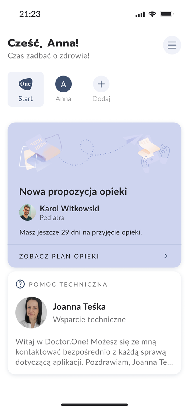
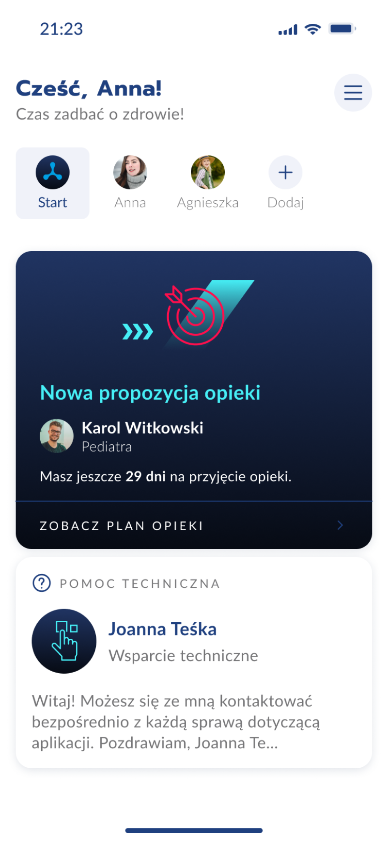
The previous design system was incomplete and inconsistent. With two apps live and white-label clients on the horizon, I needed to rebuild from scratch - and do it right.
This was a solo project. I designed the entire system from scratch: the architecture, every component, all the documentation, the white-label workflow and the developer onboarding.
No other designer was involved.
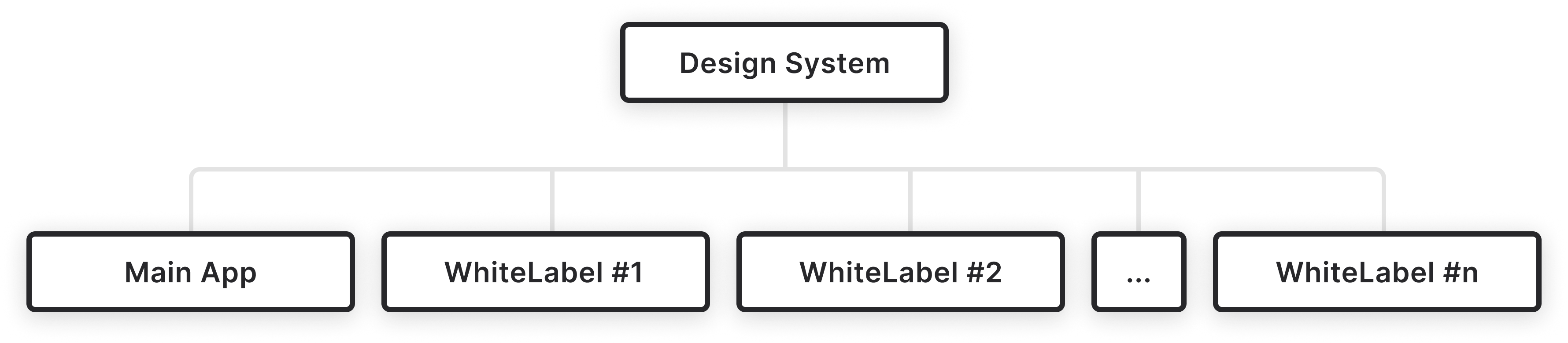
Built in layers, so a change cascades everywhere.
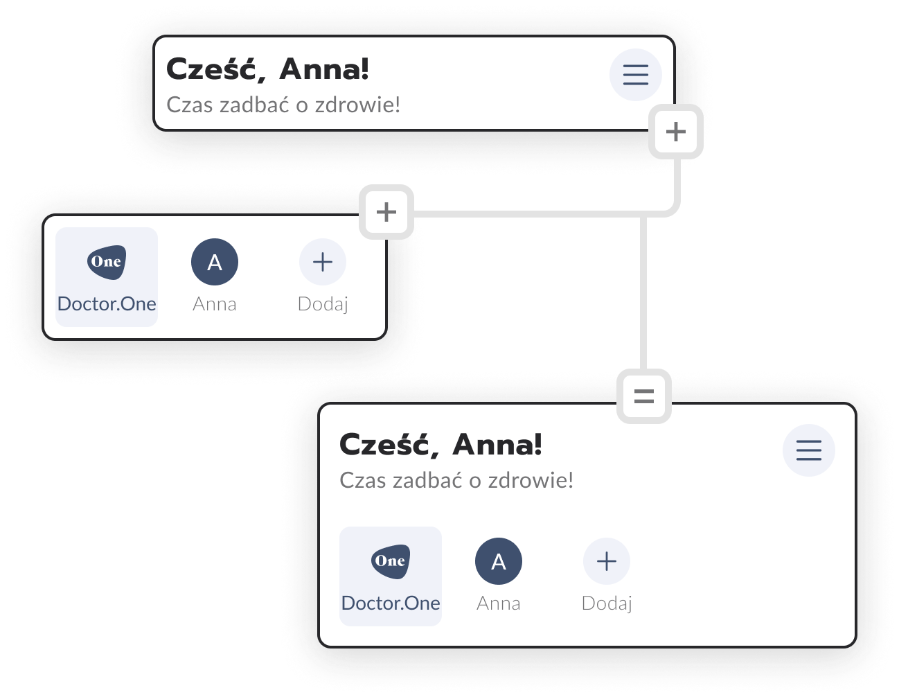
Tokens feed components. Each component is reused across screens or becomes the foundation for more complex ones.
A change at any level flows automatically through the entire system. One source of truth for everything.
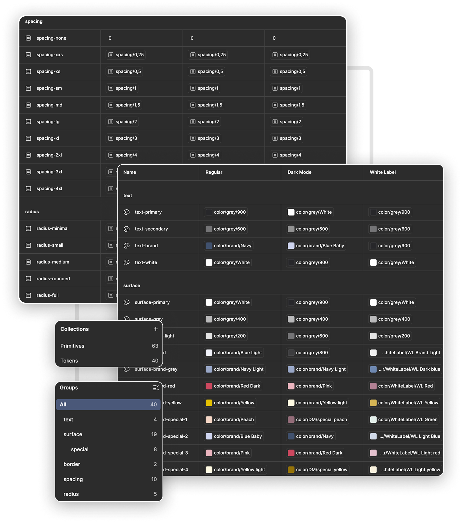
Every value, named and resolved by mode.
Semantic tokens point at primitives and each one resolves differently for Regular, Dark Mode and White Label. The same surface-brand is Blue Light in one context and a client's brand color in another. Nothing is hand-picked twice.
No room for guesswork. No room for interpretation.
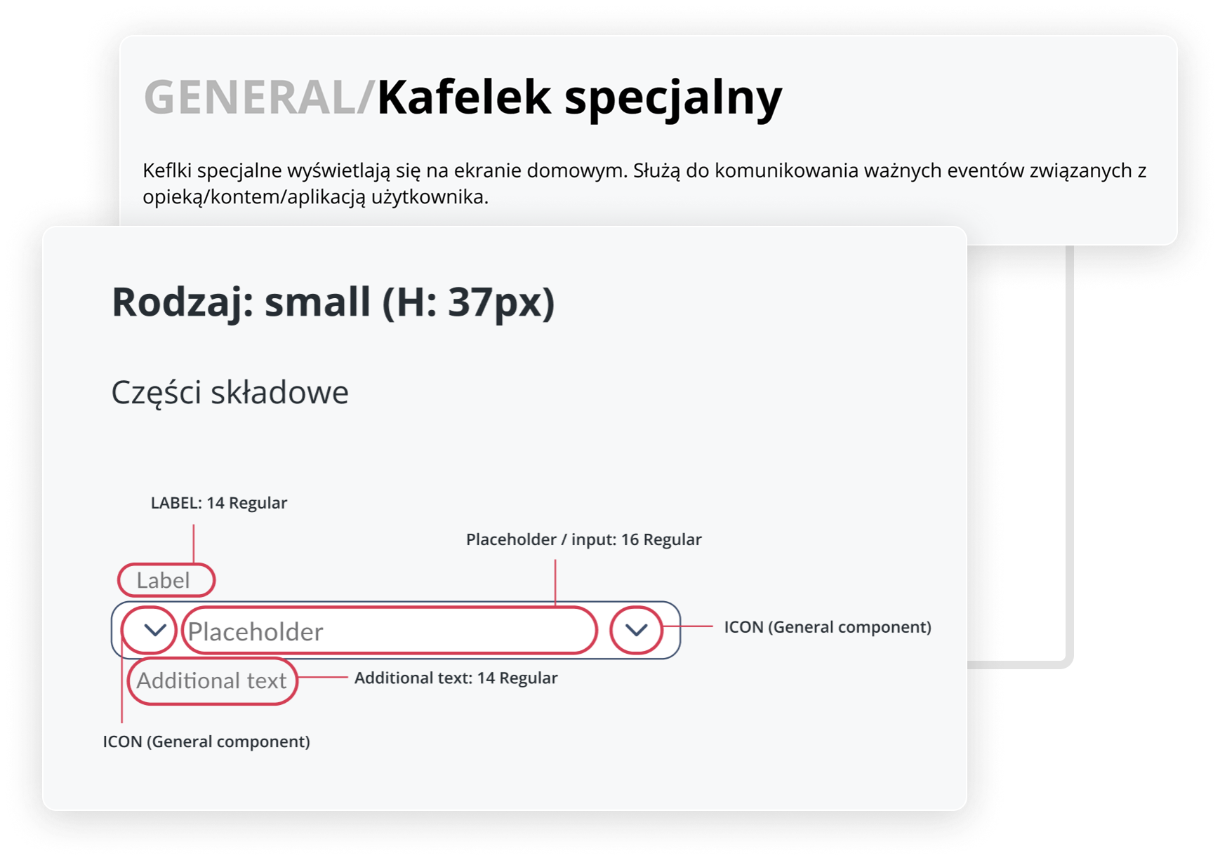
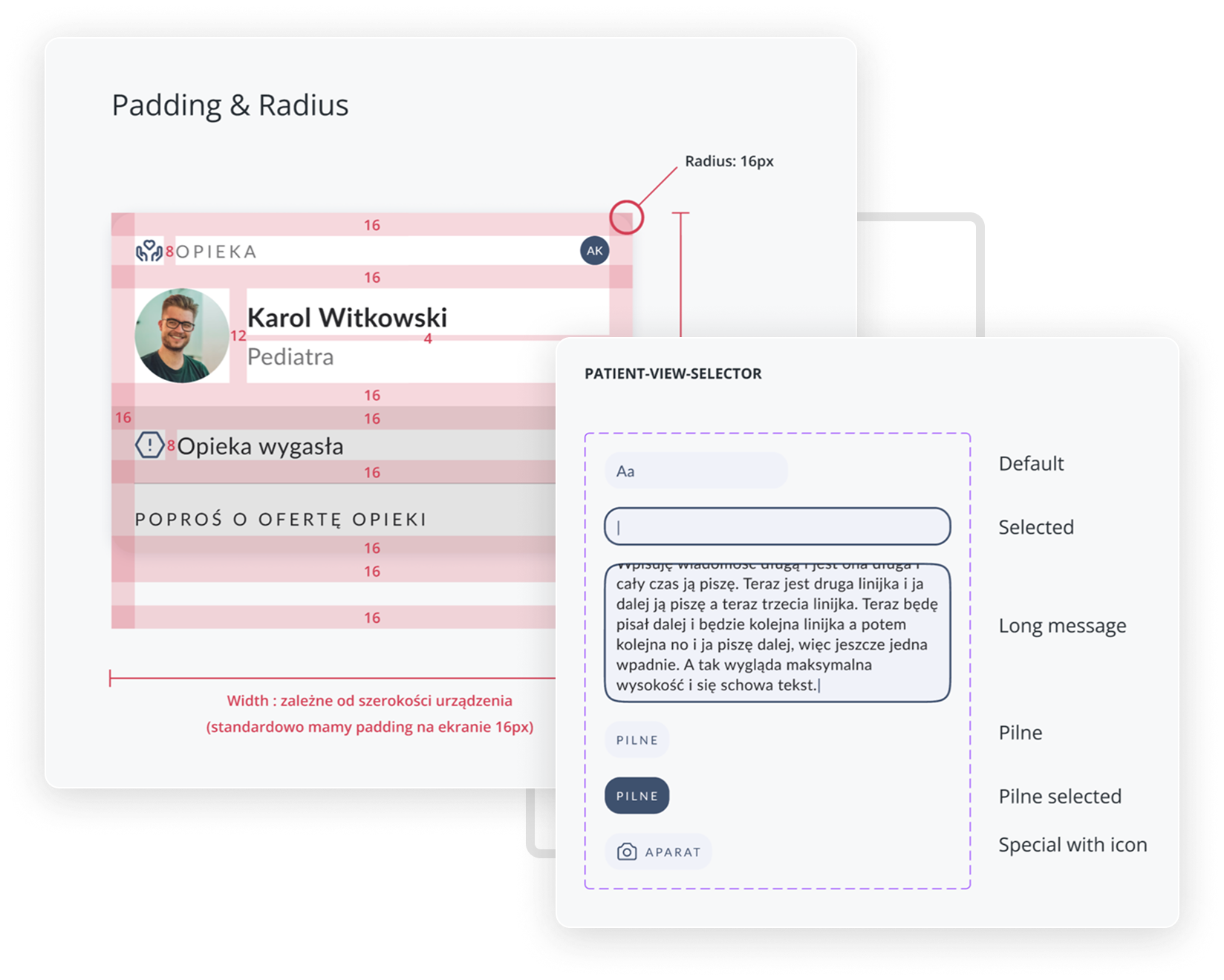
Poor documentation was the main reason for inconsistent implementation, so I made it an integral part of every component, not a process afterthought. Each card carries the name, a usage description, labeled anatomy, padding & radius specs and every variant. Then I onboarded developers to the logic behind it all.
Someone else's brand, our logic underneath.
Every white-label client gets a separate app, its own identity and needs, but the same architecture, the same rules, the same quality. The client provides brand documentation; I introduce a new token set. One switch, and the entire app adopts the new branding.
Same screen. Same component tree. Same spacing and radius. Only the token set changed - and the whole product reads as a different brand.
The challenge I solved: deliver the feel of another brand without losing the consistency and logic of our own.
Clear rules are also a business argument.
Defined system rules set the scope of what white-label enables. The client knows what they get; we know what we deliver. Misunderstandings are eliminated before they happen.
Every new brand meant manual rework across the product — slow, error-prone, and impossible to promise to a client.
The client provides colors and illustrations, I introduce a new token set, and one switch adopts the new branding across the app.
A good design system is invisible.
The user never sees tokens or components, they see a consistent product that works the way it should. Behind it: two apps, multiple white-label clients, and 15–20 developers working from one source of truth.
The system paid for itself fast. Design turnaround on a new white-label brand dropped to under an hour, deployment to under four. Reported visual and implementation bugs fell by 70%. What used to take weeks and breed inconsistency now ships in an afternoon - done right the first time.