UI leadership for a global brand.
WWF Poland needed to redesign pomagam.wwf.pl — a platform for adopting animals and making donations. I joined as UI lead, owning the visual direction and designing the cart & payment flow that decides whether a donation actually happens.

The existing solution looked outdated and wasn't converting. WWF needed something fresh, comprehensive and effective — for one of the world's largest conservation organizations.
I joined as UI lead when UX research and low-fidelity wireframes were already complete. I owned the visual direction and key design decisions.
Together with two designers, we worked through the full high-fidelity design, refining solutions collaboratively. In parallel, I independently designed the UX for the cart and payment flow — the most critical element of the platform from a conversion standpoint.
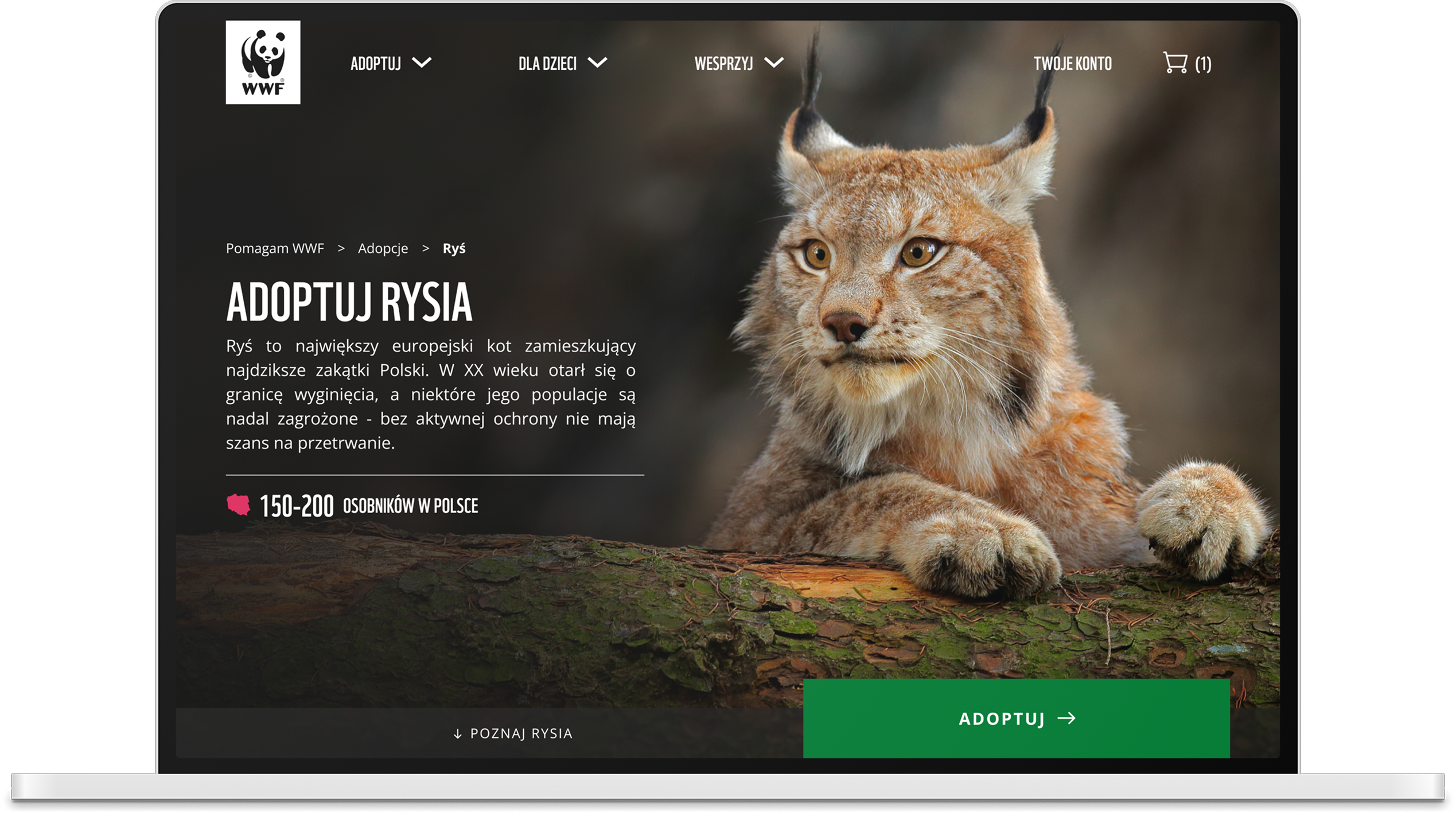
Let the animal carry the page.
The platform had to move people, not just inform them. The idea was always to put the animals first. I went for full-bleed wildlife photography, a bold condensed headline and a single, unmissable call to action. Every adoption page opens with the animal you're about to protect: emotion first, the donation one click away.
Two payment models, one clear cart.
The key challenge was presenting different product types in a single cart: one-time donations and subscriptions. Two fundamentally different payment models had to be shown clearly and without ambiguity.
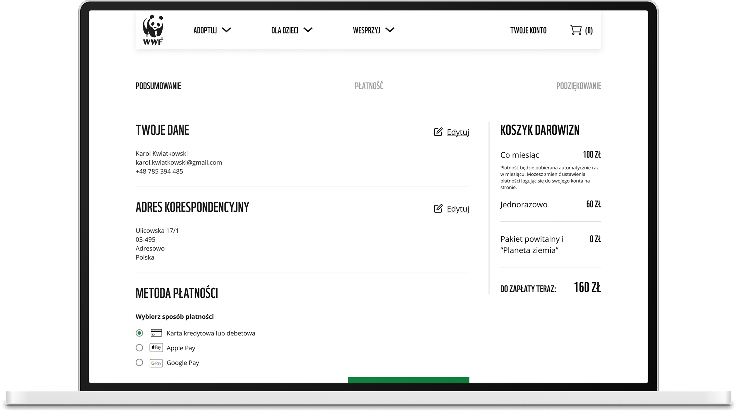
A user who doesn't understand what they're paying for feels tricked and loses trust in the organization.
Banda Pandy
One of the most interesting parts of the project was Banda Pandy, a section dedicated to children. We designed a completely separate, playful, comic-book-inspired visual language within the same project, but with its own identity.
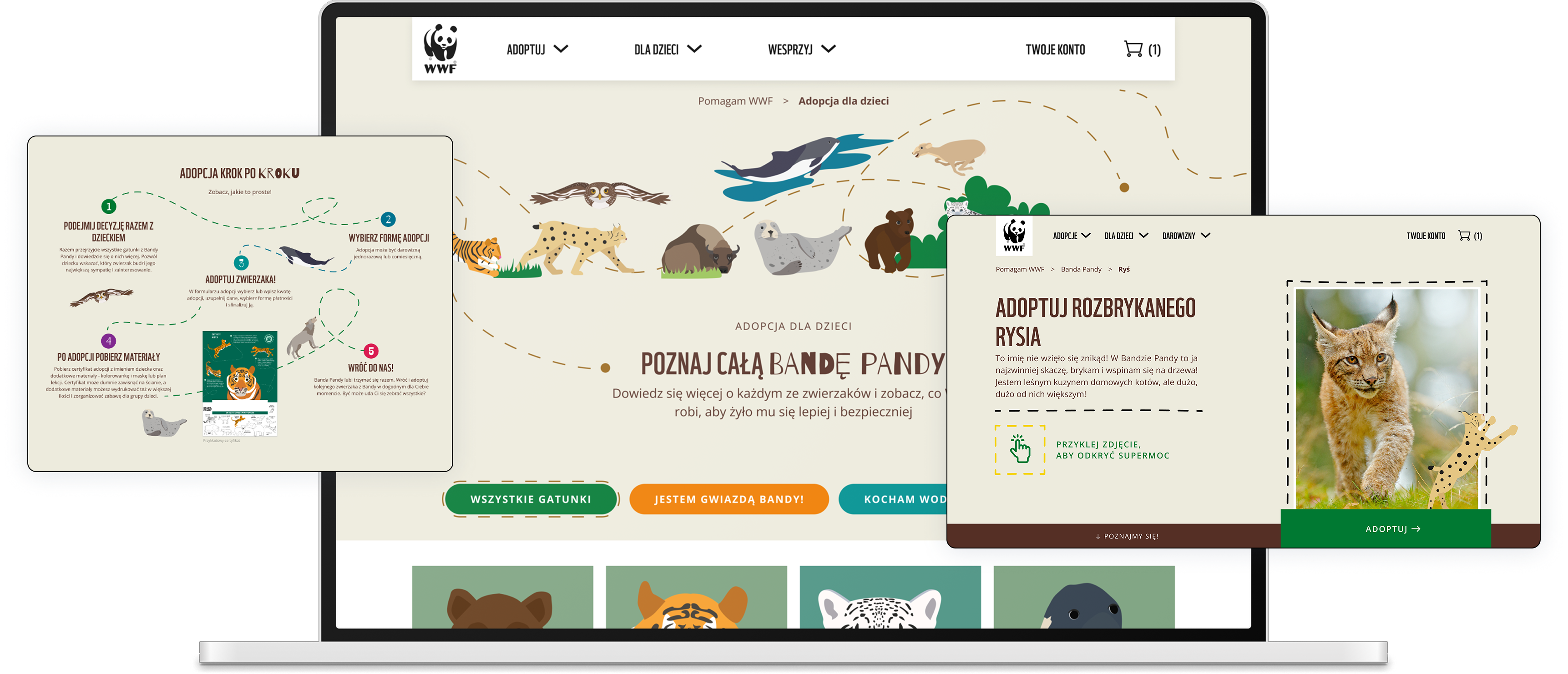
Proof that system consistency doesn't mean uniformity.
Trust that turned into more work.
The quality of our work built trust and led to continued collaboration. The next phase was a survey form and a voting guide — extending the visual language from pomagam.wwf.pl into new formats, and building a component set for question screens and result pages.
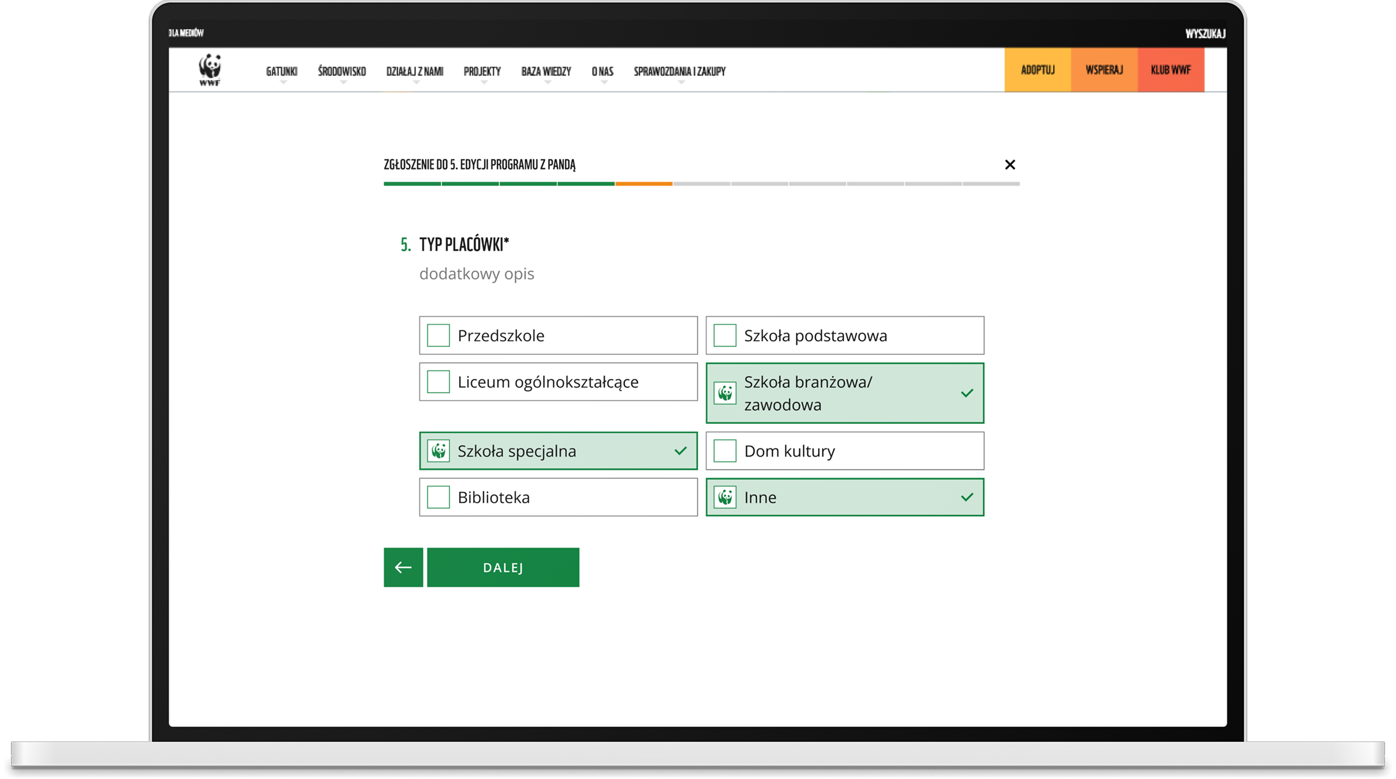
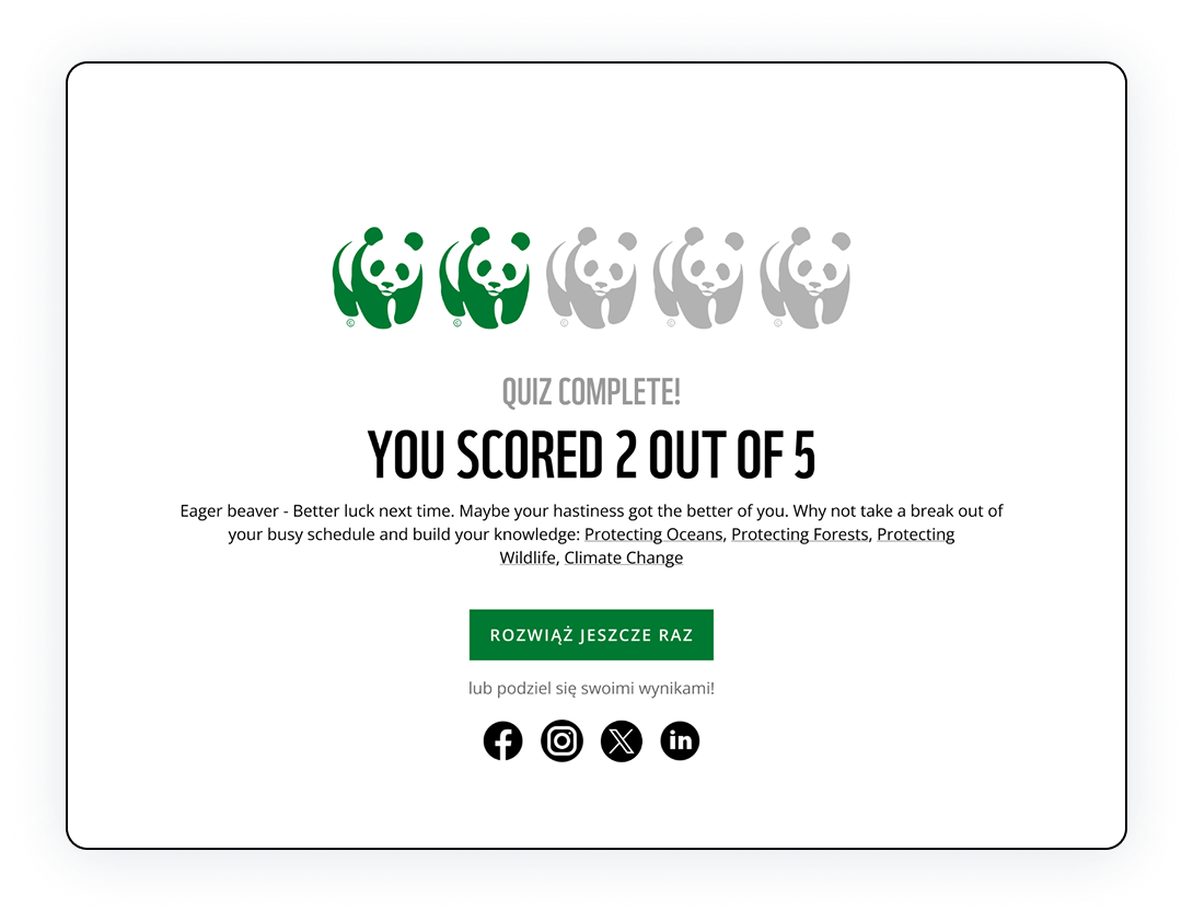
A live platform for one of the world's largest conservation organizations.
Completed donations rose 27%, and average transaction value increased by 20%. The redesigned cart didn't just remove confusion between one-time and recurring gifts - it moved more people through to a finished payment, and got more of them to give more.
See it yourself - pomagam.wwf.pl →